
Readings about Forms & Delivery
25 Understanding Visual Rhetoric
Jenae Cohn
Visuals can dramatically impact our understanding of a rhetorical situation. In a writing class, students do not always think that they will need to be attentive to visuals, but visual information can be a critical component to understanding and analyzing the rhetorical impacts of a multimodal text. This chapter gives examples of what visual rhetoric looks like in everyday situations, unpacking how seemingly mundane images like a food picture on social media or a menu at a restaurant, can have a persuasive impact on the viewer. The chapter then offers students some terms to use when describing visuals in a variety of situations (Writing Spaces).
********
This essay is a chapter in Writing Spaces: Readings on Writing, Volume 3, a peer-reviewed open textbook series for the writing classroom.
Download the full volume and individual chapters from any of these sites:
• Writing Spaces: http://writingspaces.org/essays
• Parlor Press: http://parlorpress.com/pages/writing-spaces
• WAC Clearinghouse: http://wac.colostate.edu/books/
Print versions of the volume are available for purchase directly from Parlor Press and through other booksellers.
Parlor Press LLC, Anderson, South Carolina, USA
© 2020 by Parlor Press. Individual essays © 2020 by the respective authors. Unless otherwise stated, these works are licensed under the Creative Commons Attribu- tion-NonCommercial-NoDerivatives 4.0 International License (CC BY-NC-ND 4.0) and are subject to the Writing Spaces Terms of Use. To view a copy of this license, visit http://creativecommons.org/licenses/by-nc-nd/4.0/, email info@cre- ativecommons.org, or send a letter to Creative Commons, PO Box 1866, Mountain View, CA 94042, USA. To view the Writing Spaces Terms of Use, visit http://writ- ingspaces.org/terms-of-use.
All rights reserved. For permission to reprint, please contact the author(s) of the individual articles, who are the respective copyright owners.
Cover design by Colin Charlton.
Library of Congress Cataloging-in-Publication Data on File
Understanding Visual Rhetoric
Introduction
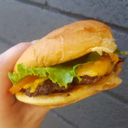
Figure 1. A cheeseburger is held in a close-up shot. Photo by Jenae Cohn.
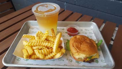
Figure 2. A hamburger and fries meal at Shake Shack in Palo Alto, California. Photo by Jenae Cohn.
You check out a review page for a hamburger joint and find yourself drooling over a close-up shot of a juicy burger with a slice of cheese oozing over the edge (see figure 1). You click to the next shot and see a cascade of golden french fries on a tray with an ombre-tinted iced tea and lemonade (see figure 2). You click one more time and find yet another delectable shot: a frosty milkshake with a mountain of whipped cream on top. You’re feeling increasingly convinced that this restaurant is where you’ll suggest that you and your friends go out to eat.
You decide to click through to see one more picture, expecting to see yet another culinary delight (see figure 3). But this next photo surprises you: it’s a picture of someone’s tray of food, but it’s dimly lit and a little hard to tell what’s there. The hamburger looks squished and flat, the meat greasy and paltry. The french fries curled up next to the burger look a bit dried out. There’s a mysterious puddle of sauce in a bowl next to the plate burger, and it’s not totally clear what’s in it. The meal suddenly doesn’t look so appetizing after all.
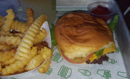
Figure 3. A poorly lit, squished hamburger and fries. Photo by Jenae Cohn.
You find yourself confused. All of these pictures are supposedly of food at the same restaurant, but the pictures look so different from each other. Knowing that the images may not accurately reflect the reality of the restaurant experience, you feel angry and misled: how can you possibly know which photos capture the “real” experience at the restaurant? Why trust any photos of restaurant food at all?
The fact of the matter is that you can’t know exactly what your restauranting experience will be like when you walk in the door of a new place. But the images clearly had a persuasive impact on you as a decision-maker: the contrast between the appetizing images and the unappetizing photos made you question the quality and consistency of the restaurant’s food, a contrast that made you wonder whether the restaurant would be the kind of place where you’d like to visit.
The point here is those photos of the food you found at the restaurant impacted your decision-making, which makes them a perfect example of visual rhetoric in action. Visual rhetoric refers to any communicative momment where visuals (photographs, illustrations, cartoons, maps, diagrams, etc.) contribute to making meaning and displaying information. You’re in a writing class right now (which is probably why you’re reading this essay and wondering what hamburgers have to do with anything), and you may think of writing mostly as words on the page. However, as more writers publish and distribute their work online, the more readers expect to find that information may be communicated in multiple modes, from text to visuals and audio. As writing and rhetoric scholar Carolyn Handa puts it,
rhetoric’s association with the written word is arbitrary, a by-product of print culture rather than the epistemological limits of rhetoric itself. We use rhetoric to help us think more clearly, write more elegantly, design more logically. Rhetoric works both to scaffold our ideas for clearer understanding and to structure our critical examinations of both visual and verbal objects. (2)
What Handa means by “the epistemological limits of rhetoric itself” (and yes, that is a mouthful!) is that, when we think of making meaning, build- ing arguments, and reaching our target audiences, we are not limited to words as a tool. In fact, if we limit ourselves to words in our arguments, we may not successfully reach our audiences at all. Some audiences need visuals to think through an idea, and using graphs and diagrams can ex- press some ideas more clearly than text can. So, we have to take visuals into account as part of understanding communication.
You may be thinking that this all sounds good, but what about images that are just pretty for the sake of being pretty? Well, those exist too, but we call those “art.” A picture of a hamburger framed in an art museum does not exist to market hamburgers (though it might make you hungry!). However, a picture of a hamburger on an Instagram feed for a particular restaurant exists as a way to encourage visitors to come and dine at the restaurant. As composition scholar and teacher Kristen Welch describes it: “visual rhetoric is a focus on the practical, relevant, and functional as op- posed to an aesthetic analysis or use of visual elements for beauty” (256). It is important to recognize when a visual exists to help us appreciate beauty (and we may even appreciate the beauty of a picture of a hamburger on an Instagram feed), but the context in which we see visuals matters an awful lot in terms of how we analyze and understand their impacts on us as viewers.
Our example of finding food photos from a restaurant online exemplifies just how accessible visual rhetoric really is in our everyday lives. Clearly, the lighting, composition, and angle of the image clearly makes a big difference in our reaction to the image and potentially our willingness to take action and respond to the image (either by going to the restaurant or not). After reading through the opening story, you may have thought of lots of other ways that you encounter other pictures of food online. On social media, for example, a lot of users post images of food they’ve cooked or eaten as a way to share eating experiences. Because of how consumer interests are driven by the platforms they use to access information, visuals are more important than ever for people to make decisions or become attracted to visiting particular spaces. But visual rhetoric is not just about persuading someone to like something or not. Visual rhetoric can also be used to help people understand a concept, break down an idea, or access important pieces of information.
We’ll explore a few more examples of what visual rhetoric can look like in a few other situations where the visuals may not just be persuasive, but they may offer necessary guidance or instruction for the viewer. After that, this chapter will offer you some advice on how you might analyze visuals in your future writing classes so that you, too, can interpret the visuals you encounter in rhetorical situations.
Why Do Visuals Matter?
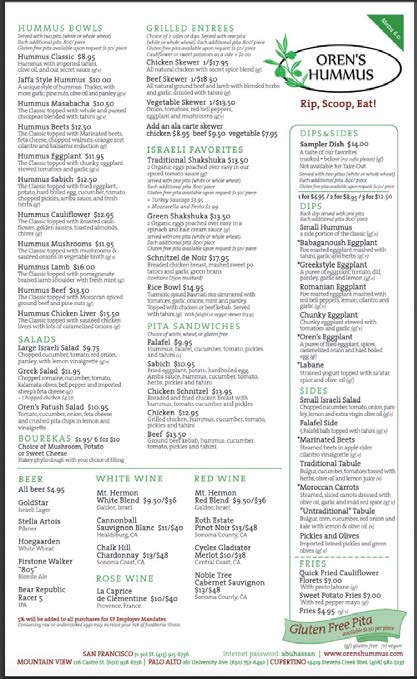
Figure 4. An image of a menu for Oren’s Hummus with three columns containing various menu items. Menu image courtesy of Mistie Cohen.
This restaurant menu doesn’t have pictures on it, but it makes visual choices that may impact which food items you decide to order. For example, separating certain food items under headers, like “Hummus Bowls” and “Grilled Entrees” gives you some quick visual information about what items you can expect to find in those sections. Even more noticeably, the section titled “Dips & Sides” is separated from the other menu items by a green box. While the words “Dips & Sides” may have helped us understand that the items in that section would be smaller-sized than the menu items outside the green box, the use of the green box is a rhetorical tool; it makes it really obvious to the restaurant goer that if they order an item from the Dips & Sides section, it’s going to be smaller than the items that are not inside the green box.
Think about this particular restaurant’s context even more: the restaurant advertises its “hummus,” a Mediterranean dip made out of garbanzo beans, in its name, but for many visitors, they may not have experienced eating hummus in the way that this restaurant serves it. For many diners, they may have experienced hummus as a dip or side rather than as a main course. However, because “Hummus Bowls” appear on the menu separately from the Dips & Sides, it’s clear that the hummus bowls can actually be eaten as a main dish rather than as a side dish. This is a new situation, a subversion of expectations, for many restaurant-goers, so the menu has to do some visual work to help the visitor understand what to expect from the food they order.
Do you see how many words it took me to explain how the Dips & Sides section differs from the other menu sections? If you were a hungry diner, would you want to take the time to listen to all of that or read that long explanation? Probably not. That’s why the document design on the menu is so important: it aligns our expectations quickly, simply, and clearly. Document design is yet another example of visual rhetoric in action, as it persuades us to make particular choices (in this case, about what we order). To learn more about components of document design in particular, you may want to look to another essay in the Writing Spaces series, called “Beyond Black on White: Document Design and Formatting in the Writ- ing Classroom” by Michael J. Klein and Kristi L. Shackleford. They make the important case that, “Good document design integrates the words on the page with appropriate imagery to fully illustrate your meaning,” a sentiment that reflects exactly what we saw happen with the menu (333).
The menu also includes some symbols to indicate which menu items may adhere to particular dietary needs, a piece of visual information that may be critical to those with allergies or sensitivities. Next to the descriptions of particular menu items, the letters “gf” and “v” indicate which items on the menu are “gluten free” (items that don’t contain binding proteins found in wheat and other grains) or “vegan” (items that don’t contain animal products, like meat or dairy); a key for these restrictions is in the bottom right-hand corner of the menu for visitors to reference if they are seeking out those indications.
Some menus will indicate these dietary restrictions using visual symbols instead; for example, other menus may include a green leaf icon next to particular items to indicate that the menu item is vegetarian or a brown-colored “G” inside a circle often indicates that the menu item is gluten-free. While you, as a reader, may have some critiques of how clearly the Oren’s Hummus menu makes these dietary restrictions clear, the point is that the visual indicators are there to guide visitors in critical ways.
You may also notice that, on the menu, the two biggest visual items are the restaurant’s logo and slogan (“Rip, Scoop, Eat!”) and the inclusion of “Gluten Free Pita” on its menu. These largest items show the restaurant’s priorities: by making its slogan and name large, the menu reminds you of its branding, while also offering you an instruction for enjoying its signature dishes: to rip a piece of pita, scoop the pita into dip, and eat it! Making the words “Gluten Free Pita” among the largest on the menu also suggests that the restaurant aims to reach a diversity of diners, even those who may be sensitive to or avoiding eating wheat-based products. The restaurant’s priorities are clear: to educate unfamiliar hummus-eaters with the process and experience of eating hummus while also convincing diners that, regardless of their dietary restrictions, there will likely be something at the restaurant that the diner will enjoy.
The point of all this analysis of the Oren’s Hummus menu is that choices in document text, color, image, and spacing matter in order to help you make choices, big and small. As you can see, visuals play a tremendous role in a) how we make decisions, b) how we receive instructions, and c) how we understand information. But let’s get a little bit more fine-grained: what elements of visual design exactly can help make certain ideas clearer than others? How do we name and define the persuasive elements of a visual? Let’s look to some elements of visual design to answer those questions.
Elements of Visual Design: Line, Color, Shape, Size, Space, Value, Texture
Line
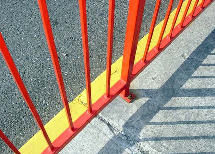
When you look at a visual, consider asking questions about line in the following ways:
• What role is the line playing in helping me understand what to emphasize? What to deemphasize?
• What role is the line playing in connecting one part of the image with the other? What relationships between the parts of the image are at play?
• What kind of pattern do I see in this image or diagram? How does the pattern help shape my understanding of the image, graph, or shape?
Color
Color can help evoke emotions in the viewer while also helping the viewer distinguish what’s important or what should be emphasized. In fact, many designers use resources like color wheels to help them determine what kinds of color combinations complement each other and what kinds of color combinations offer contrast (see figure 6). It is generally agreed upon that particular colors evoke different emotions than others; for example, colors like orange and red tend to convey warmth or passion while colors like blue and purple tend to convey coolness or calm.
However, some colors have deep cultural associations. For example, in China, the color red tends to signify good luck, joy, and happiness; that’s why gifts given at Chinese New Year’s tend to be in red envelopes and also why wedding dresses in China are often red-colored. In Western cultures, on the other hand, red can more often signify danger or caution. In the United States, we may think of red as the color for a stop sign, for example.
Lots of resources online exist to help designers keep particular cultural associations with color in mind, especially in sensitive situations! For example, while wearing black to a funeral in the United States would be conventional and respectful, it would actually be considered quite odd to wear black to a funeral in Cambodia, where the color white is much more often worn for events of mourning.
You may not be able to account for all of the different situations where colors may signify different things to different viewers, but as a reader and composer, you will want to be attentive to how and where color is used, even if the possibilities for interpretation may vary.
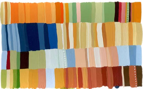
Figure 6. An abstract pattern of rectangles in a variety of muted earth tones, ranging from oranges to greens, blues, and browns. Image is titled “color swatches” by Nancy Muller (www.flickr.com/photos/kissabug/2469838932) and is licensed under CC BY-NC-ND 2.0.
When you look at a visual, consider asking questions about color in the following ways:
• What is color (or the lack of color if the visual is black-and-white) emphasizing here? What is de-emphasized?
• Given my understanding of color, what emotions does the color evoke for me? What do the colors in the image remind me of?
• How might this visual change if the color scheme was inverted? How would the impact on the viewer be altered?
Shape
Shapes that come from the real world—like the clouds and trees or the light bulbs and rocket ships—tend to be culturally situated in the same way that colors can have different cultural associations. Yet as readers of visuals, we can analyze the roles that shapes play based on our own understanding of the audience’s needs and purposes when accessing the visual.
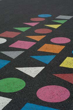
Figure 7. A pattern of circles, squares, and triangles in bright colors contrasted on an asphalt surface. Image is titled “DSC_1384” by Michael Poitrenaud (www. flickr.com/photos/michel_poitrenaud/10595502904) and is licensed under CC BY-NC-SA 2.0.
When you look at a visual, consider asking questions about shapes in the following ways:
• What does this shape typically signify? Where have I seen this kind of shape before?
• Given my understanding of this shape, what emotions does the shape evoke for me?
• What might the shape be drawing attention to?
Size
In visuals, different elements may be large while other elements may be small. Typically, the elements that are larger sizes than other elements are of greater importance than the elements that are smaller sizes. But larger things are not always more valuable; the other elements in the visual may visually draw attention to smaller-sized items so that we don’t lose sight of the smaller parts of the visual entirely. Large images next to small images may also be used to help us compare two parts so that we can see how they are related to each other (see figure 8).
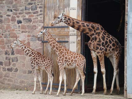
Figure 8. A row of three giraffes, ranging from a small giraffe to a larger one, line up outside of a doorway. Image is titled “Giraffes” by Smallbrainfield (www. flickr.com/photos/smallbrainfield/3378461407) and is licensed under CC BY- NC 2.0.
When you look at a visual, consider asking questions about size in the following ways:
• Which elements in the visual are larger than the other elements?
• How do the sizes of different elements in the visual impact your understanding of what’s in the visual?
• What is your reaction to seeing the different sizes in the visual? Do any of the sizes of the elements surprise you? Why or why not?
Space
In between or around the elements in a particular visual, there is always some empty space. Some designers call this “white space” or “neutral space.” Space is critical to help distinguish between the different elements in a visual. Without space, particular elements in the visual may be hard to distinguish or may have the effect that the visual is “busy” and, therefore, hard to read and understand.
Even in a document that is mostly text, space signifies meaning. For example, when you split paragraphs into their individual units, the space before and after the paragraph indicates that one thought is about to begin while another thought ends. Similarly, in other kinds of visuals, space might help a certain element stand out from other parts or it might help you understand where one part of the image begins and another part ends (see figure 9).
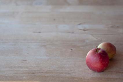
Figure 9. Two red apples are clustered in one corner of a wooden table, drawing attention to the fruit in an open space. Image is titled “apples” by Paul Bausch (www.flickr.com/photos/pb/6129499766/ ) and is licensed under CC BY-NC-SA 2.0.
When you look at a visual, consider asking questions about space in the following ways:
• How much “white space” or “neutral space” is there in the visual? Is this space evenly distributed or are the spaces uneven?
• What effect does the space in this visual have? How does the space break up or distinguish different elements of the visual?
• What is your reaction to seeing the space in the visual?
Value

When you look at a visual, consider asking questions about value in the following ways:
• How do different values create importance? Depth? What is emphasized?
• What effect does value in this visual have? How does value break up or distinguish different elements of the visual?
• What is your reaction to seeing different values of visual depth in this visual?
Texture

When you look at a visual, consider asking questions about texture in the following ways:
• What kinds of textures do I see in this visual? Are textures clearly implied or does the visual just include one kind of texture?
• What effect does texture (or the lack of texture) have on understanding what I should focus on in this image? How does texture break up or distinguish different elements of the visual?
• What is your reaction to seeing different textures in this visual?
Concluding Thoughts
Works Cited
Handa, Carolyn. Visual Rhetoric in a Digital World: A Critical Sourcebook. Bedford/St. Martins, 2004.
Klein, Michael J., and Kristi L. Shackelford. “Beyond Black on White: Document Design and Formatting in the Writing Classroom.” Writ- ing Spaces: Readings on Writing, edited by Charles Lowe and Pavel Zemliansky, vol II, Parlor Press, 201, pp. 333-349. http://writingspaces.org/ klein-schackleford–beyond-black-on-white.
Welch, Kristen, Nicholas Lee, and Dustin Shuman. “Teaching Visual Rhetoric in the First-Year Composition Classroom.” Teaching English in the Two-Year College vol. 37, no. 3 March 2010, pp. 256-264.
This essay is intended as an overview of what visual rhetoric is and how it functions alongside other rhetorical strategies that students may encounter in their composition courses. This essay could work well in a unit introducing students to definitions of “rhetoric” so that students can continue to complicate their understanding of rhetoric beyond alphabetic text. This chapter may also be useful to introduce a unit on multimodal composition, especially when students are starting to look at examples of model multimodal texts and understanding the role that visuals may play in those texts. Students may have varying degrees of abilities to describe or name the effects that visuals may have on an audience, and this reading is intended to help students articulate the rhetorical work that visuals do while also giving them some vocabulary to name the basic elements of a visual. This chapter focuses primarily on the analysis of visuals rather than on the composition of visuals, so bear in mind that this chapter does not include tool suggestions or any “how-to” tips on creating visuals. This chapter also does not cover best practices on attributing images appropriately (via Creative Commons licensing, for example) though a conversation around visual rhetoric for multimodal composing should orient students to these best practices so that students understand how to use and incorporate images legally and ethically into their work.In this chapter, I bring in examples that are accessible to a diverse student populace. That said, it may be worth engaging in class conversation about the ways in which certain visuals may have different effects on different audiences, as particular pieces of iconography or certain photographs may be understood differently by audiences with various cultural backgrounds or experiences. When selecting images for students to choose or analyze, bringing in historical or cultural context is useful since that information may shape students’ abilities to understand the rhetorical purpose and situation for particular visuals.
Here I offer several in-class activities that I regularly use in line with the conversations offered in the textbook chapter to supplement what the chapter introduces.
Questions1. In the first section of this essay, you experienced the story of choosing a restaurant to dine out at with your friends. In this story, the different kinds of pictures shaped the decision made. When have you made a decision based on pictures or visuals? How did the pictures or visuals affect your decision exactly?
2. In the discussion of the menu from Oren’s Hummus, it’s clear that the organization and design of the information may impact how a diner might decide what to eat. If you had the opportunity to redesign the menu at Oren’s, what decisions would you make? Why would you make those decisions?
3. There are six elements of visual design named in this chapter. Which of these elements were new to you? Which were ones you had encountered before? Individually or in a small group, take a look at either a picture of a poster from the Works Progress Administration (www.loc.gov/pictures/collection/wpapos/) OR find a photograph from the Associated Press images database (www.apimages.com/) and see if you and your group members can identify the elements of design in one or two of the historical posters or photographs. Use the guiding questions in the “Elements of Visual Design” section of the chapter to help guide your understanding of the images.
Activities
The following are four class activities that can help support students in their development of understanding and interpreting visual rhetoric.
Three Keywords.
Extreme Makeover: Document Edition
Ask each student to identify an essay, multimodal project, or class assignment. It can be something that they produced for your class or for a different class. After they’ve picked the project they’ve made, ask them to analyze the design choices for the document. What size fonts did they choose? What kinds of pictures did they include, if any? What were some other choices in terms of the document and visual design that they made? Ask them to name the audience and purpose for the document too so that they recognize and name the full context for creating the document. Then, ask them to consider who else might have had a stake in the document they produced. Is there a different audience that they can imagine being invested in that piece of work? Once the students have each named an alternative or a secondary audience for the document, ask them to take a few minutes to do an extreme “makeover” on the document, considering how they would change the layout, organization, design, and inclusion of visuals to accommodate the new audience’s needs. An alternative for them would be to consider how they would redesign the document for publication in a particular platform or news site aggregate, like Buzzfeed or The Huffington Post. These platforms might also change the way they’re orienting the text as well, but for the purposes of this exercise, you may want to encourage students to think primarily about the visuals. After they’ve done a version of their “extreme makeover,” engage in a conversation about the makeover process. What elements of the design did they decide to change? How did their understanding of audience and purpose impact their visual choices?
Comparing Data Visualizations
Caption Contest: Creating Effective Captions and Alt-Text for Image
Asking students to write captions for images can be a really interesting moment for students to interrogate and unpack their assumptions about particular images and what they’re privileging as viewers and authors of multimodal or image-rich projects. A conversation about captions can also be a good opportunity to help students understand accessibility and ways to make images readable for a variety of audiences. To start this class activity, you will want to define two different kinds of image captions that exist for visuals published on the Web: captions and alt text. The caption is the text that displays below an image (much like what you would see in a printed textbook and in this particular textbook chapter for that matter). Alt text, on the other hand, is a short, written description of an image Web authors use to describe an image in a sentence for someone using screen reader software. For a reader using screen reader software, the alt text and the caption are both read to offer clarity on what the visual includes. For this class activity, project an image or photograph in a shared space and ask everyone in the class to write both a caption and alt text for the image. You may find it useful to show a few examples of captions and alt text to help clarify the activity. Alternatively, you could have students start with writing captions (since students may have more exposure to reading captions than alt text) and then move to alt text. After students have written their captions, ask them to share with a partner, comparing how their captions are similar or different. Each pair should then take a few minutes to decide which caption they would use for the photo or image if they were publishing the image themselves, justifying their choice as a pair. The results can then be shared with the class where the instructor can lead a longer class conversation about the impacts of captions and the challenges in writing captions to capture the impacts of visuals on the audience.
Read Jenae Cohn’s “Understanding Visual Rhetoric.”
Keywords from this chapter in Writing Spaces
visual, rhetoric, multimodal, multimodality, image
Author Bio
Jenae Cohn is the director of academic technology at California State University, Sacramento. She is the author of the forthcoming book Skim, Dive, Surface: Teaching Digital Reading, which will be published by West Virginia University in June 2021 (Inside Higher Ed).
Media Attributions
- cohn-understanding-visual-rhetoric-1
- cohn-understanding-visual-rhetoric-2
- cohn-understanding-visual-rhetoric-3
- cohn-understanding-visual-rhetoric-4
- cohn-understanding-visual-rhetoric-5
- cohn-understanding-visual-rhetoric-6
- cohn-understanding-visual-rhetoric-7
- cohn-understanding-visual-rhetoric-8
- cohn-understanding-visual-rhetoric-9
- cohn-understanding-visual-rhetoric-10
- cohn-understanding-visual-rhetoric-11
both the study and use of strategic communication, or talk and text in social interaction; the way that rhetors/authors/writers/composers use language in order to communicate with an audience; the art of using language effectively so as to communicate with, persuade, or influence others
the employment of more than one mode: text, sound, voice, image
